

Website Redesign
Website Redesign
Problem
Like many COVID-related projects, the Pfizer COVID-19 website was developed rapidly, leading to a departure from the usual development cycle. This expedited process largely excluded product designers from key stages, with developers primarily driving the changes without much oversight. As a result, the website ended up being challenging to navigate, hard to find information on, and visually unappealing for users to engage with.
GETTING STARTED
To kick off the website's redesign, our initial move was to thoroughly audit the existing site, examining its content, structure, and diving into data and analytics for insights that could inform our redesign strategy.
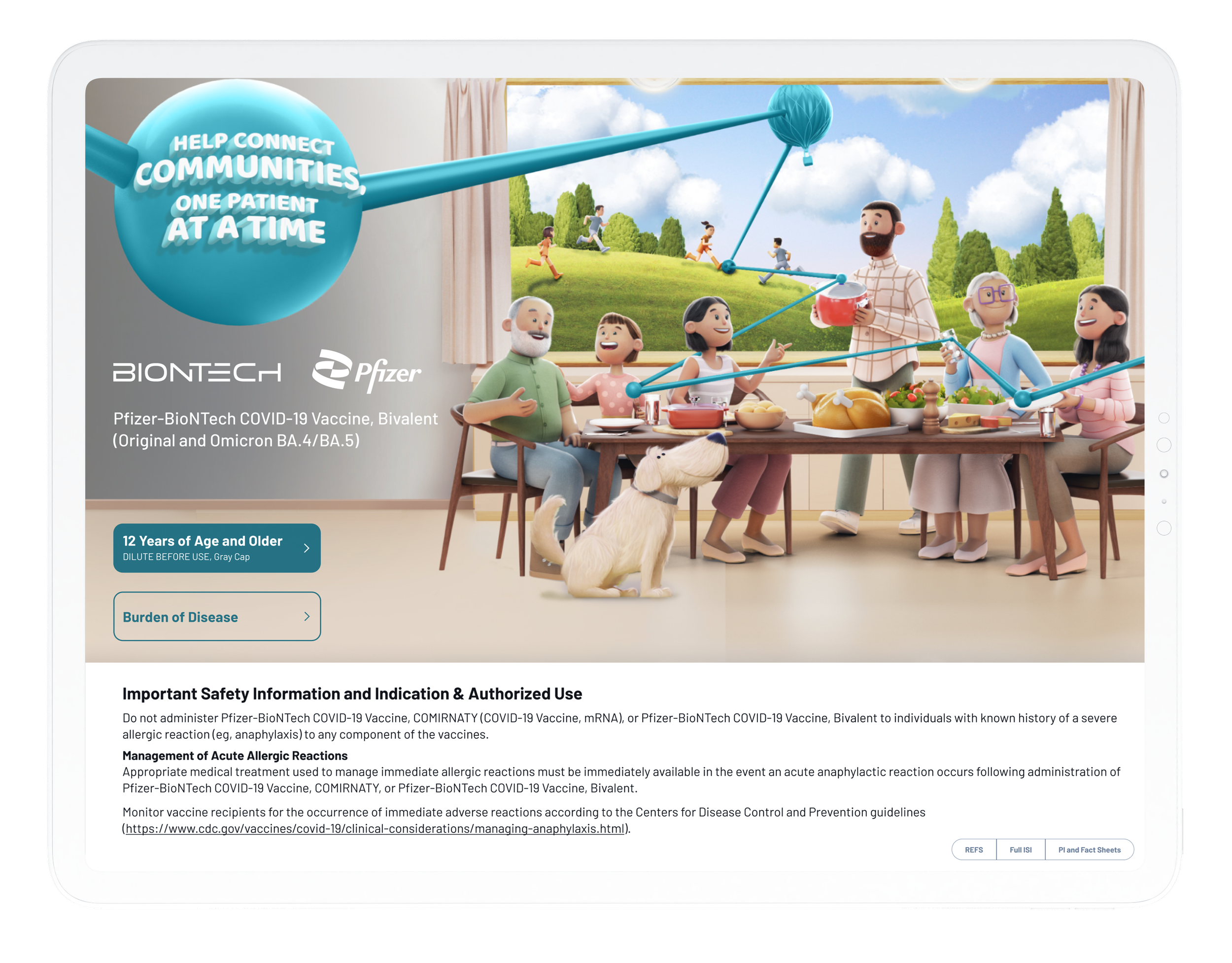
From a UX perspective, redesigning the Pfizer website presented a unique challenge. We had to segment the site into three distinct parts: one for the FDA-approved drug, another for the conditionally approved drug, and a third for shared resources like downloadable materials and basic drug facts. Each section needed to stand out visually while being designed with the future in mind—eventually, they would all merge back into a single, cohesive site. This requirement posed a particularly interesting challenge for navigation.
Throughout this process, we were committed to ensuring that our redesign met the highest standards of usability and accessibility. By incorporating WCAG (Web Content Accessibility Guidelines) standards, we aimed to make the website usable and accessible for all users, regardless of their abilities or disabilities. This consideration was integral to our approach, ensuring that as the website evolves, it remains inclusive and accessible to everyone. Additionally, it was crucial to plan for these future iterations during the redesign process to avoid the necessity of a significant overhaul down the line, ensuring a smoother transition and continuity for the website's evolution.
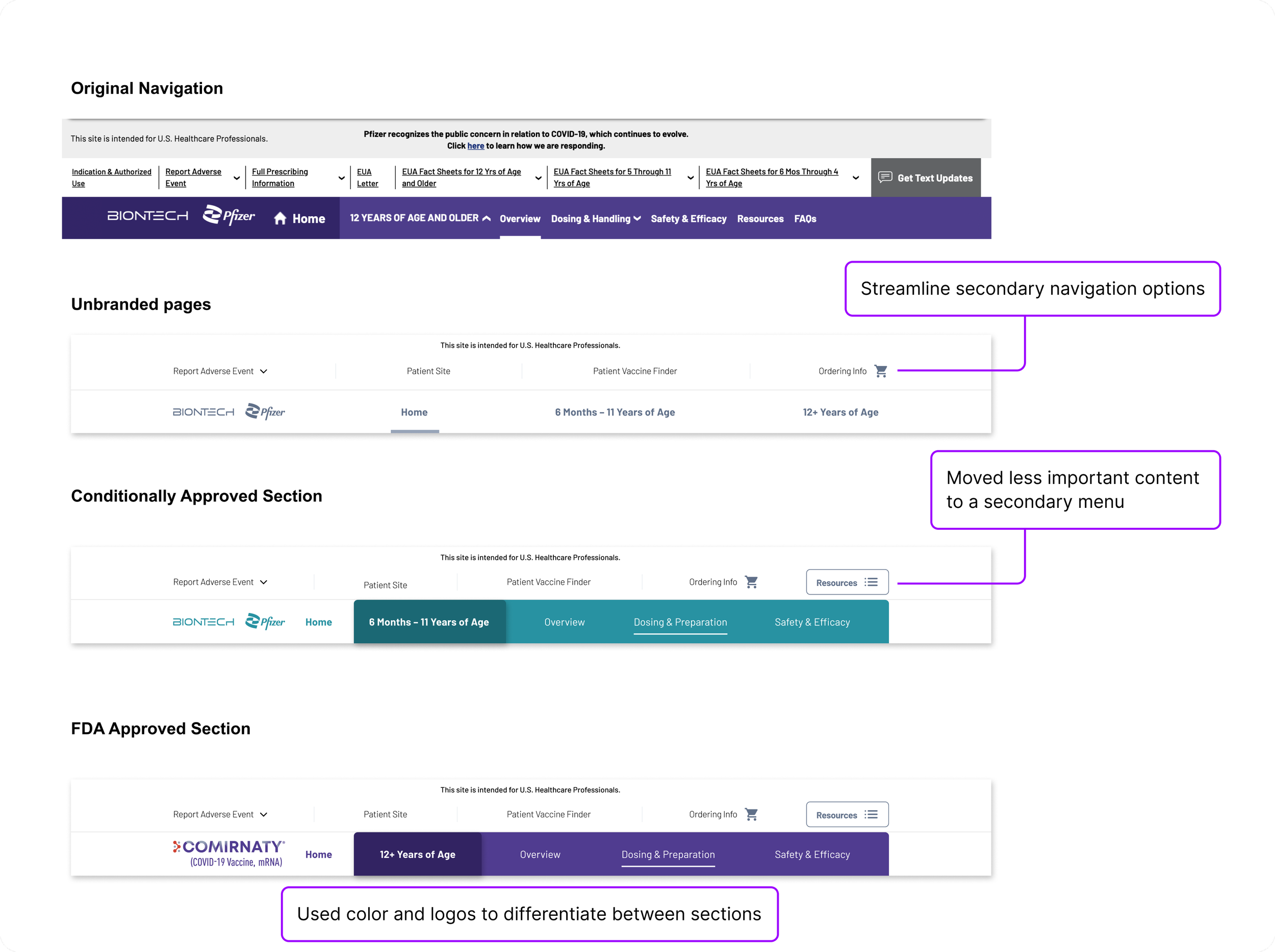
Navigation played a pivotal role in the website's intricate design, tasked with a dual mission: it had to clearly inform users that the website was segmented into various parts, and it also needed to facilitate seamless access to these distinct sections. All of this had to be accomplished while meticulously adhering to FDA guidelines, adding another layer of complexity to the design challenge.
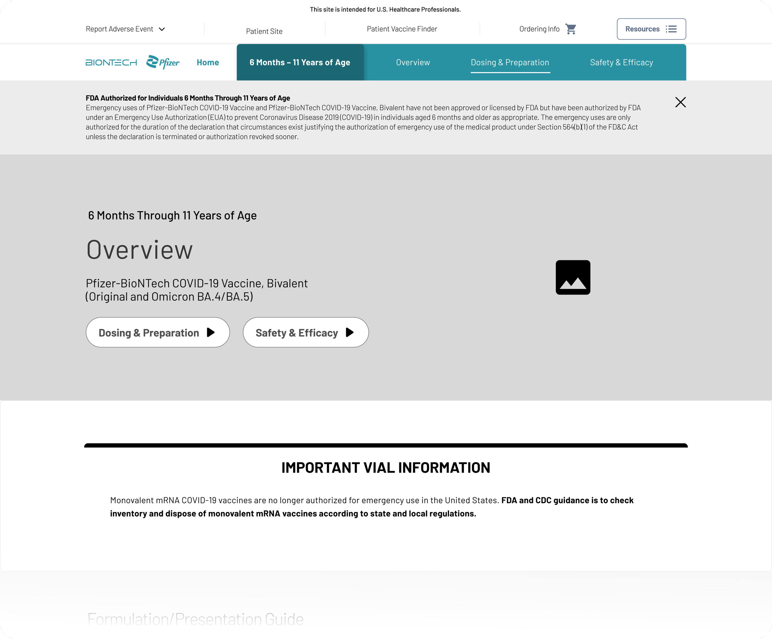
To mitigate cognitive load, we developed wireframes for a standard page structure that remained consistent across all sections of the website. This approach served a dual purpose: it ensured a uniform user experience regardless of which section was being accessed and enabled my design team to design the website's pages more quickly and cohesively.
By establishing a design system based on atomic principles, I ensured that all members of my design team were aligned in their approach to this project. For more insights into this process, you're welcome to explore further here. Additionally, I collaborated closely with the development team to integrate design tokens. This strategy was key for future updates, especially when transitioning sections from the conditionally approved to the fully approved part of the website, allowing us to swiftly update the tokens on those pages for a smoother and more streamlined process.
BUILDING THE WEBSITE
Facing a tight deadline due to pending FDA approval, we were tasked with designing the entire 25+ page website in just 3 days.
Thanks to the groundwork we had laid earlier—setting up a design system, establishing the website's structure, and crafting a new aesthetic—we managed to execute the design within the tight 3-day deadline. With four designers working tirelessly, alongside copywriters and other team members, all collaborating in the same Figma file, we were able to construct the entire website in a remarkably short period.
A critical factor in our success was the close collaboration with the development team. By granting them access to the more complex sections of the website immediately after design—or even while still in progress—we could accelerate the development of intricate parts of the site. This approach not only sped up the build process but also enabled us to integrate refined details, such as micro-animations, into the website's design, enhancing the overall user experience.
FINAL THOUGHTS
By establishing a robust design system and collaborating intensively with developers, we successfully redesigned a complex, multi-section website within a tight deadline, incorporating considerations for future updates to ensure seamless navigation and a cohesive user experience despite the urgency of pending FDA approvals.
Experience the Redesign Live
Visit the live site and witness the redesign in action. Take a firsthand look at the new website.
See other projects for the Pfizer COVID-19 brand.
See how we improved the accessibility of the Pfizer COVID-19 iPad application.

Explore how we optimized the user experience upon reaching the COVID-19 vaccine website.