Best Fonts You’ve Never Heard Of
Every designer I know feels like they consistently use the same fonts, even though there are hundreds of great new fonts. I am going to do the research for you and post about my favorite typefaces that you have probably never heard of! If you know any fonts that you think I should be including comment below or message me, I will be updating this list to make sure it is the most up to date.

Zenon by Riccardo Olocco at CAST foundry
Zenon is a modern Roman typeface that was designed from typographic proportions from the Renaissance. Zenon has a modern slab serif feeling but is unique from other slab serif fonts like Roboto Slab that every brand uses allowing you to stand out. The italics on Zenon are particularly beautiful and would make great display text.

Sole Serif by Luciano Perondi at CAST foundry
Soel Serif is a Roman newspaper typeface specifically designed to withstand lower quality printing techniques. Sole Serif is a great substitute for Times New Roman offering more visual interest as well as a large type family.
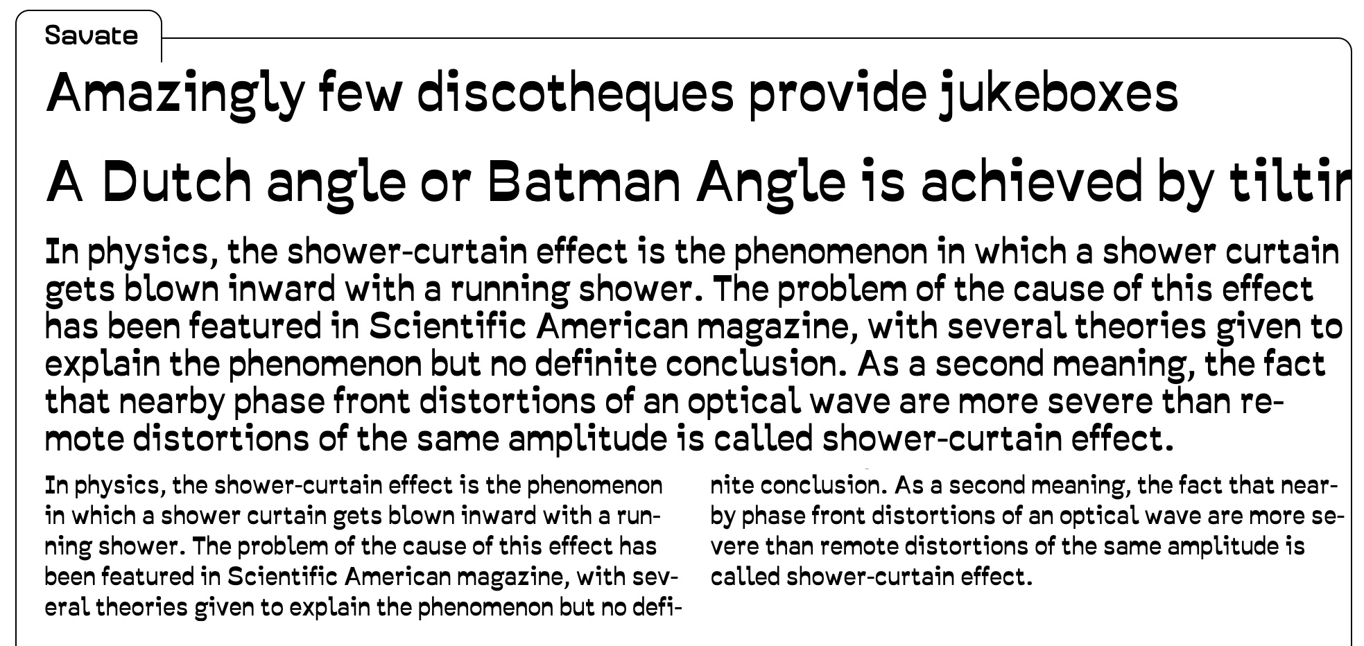
Savate by Wech at Velvetyne Foundry
Savate is an interesting typeface. It has horizontal stress instead of vertical stress giving the text a unique texture that isn’t expected. This typeface isn’t the best for setting long paragraphs of text instead it is a great for smaller amounts of text as well as headlines.
One reason I wanted to highlight Velvetyne Foundry was because they have an interesting model. All of their typefaces are open source and free making them a low-risk high-quality place to get new typefaces for your designs.

Marr Sans by Commercial Type
Marr Sans is a grotesque sans serif. I like Marr Sans because it has personality and character. One of the current trends in graphic design is geometric sans serifs that don’t have a lot of personality. Marr Sans has a personality while still remaining relevant. If you need any more convincing that this is a great typeface just look at that two story g, it’s beautiful!

Alverata by Gerald Unger Published by Type Together
Alverata is a unique typeface inspired by Romanesque capitals. My favorite part is that along with the standard style Unger designed informal and irregular styles inspired by Insular letterforms and uncials. The informal and irregular styles are unique and different providing lots of room to play and explore when designing.

Nordvest by Nina Stössinger
Norvest has a slightly thicker horizontal stroke than the vertical, giving it a unique design that isn’t jarring and weird to the view. I find the italic even more successful than the roman; it is playful and has a great sense of movement while relating directly back to the roman design. Norvest is also a winner of the 2017 Type Directors Club Typeface Design Award.

Stratos by Yoann Minet Produced by Production Type
If you are tired of Trade Gothic or other Geometric Grotesk fonts then Stratos is for you. While at heart it is a Geometric Grotesk typeface, it plays with the weights, widths, and expectations of a normal Geometric Grotesk typeface. The best description comes directly from the Production Type website:
“The first and most obvious of these surprises can be seen in the difference between its upper- and lowercase. The caps are condensed, inspired by gothic wood type of the 20th century, while the minuscules are akin to certain classic geometric sans serifs, with circular rounds (o, d, b, p, q) and horizontal terminals (a, c, e, g, s). This contradiction presents intriguing possibilities. Used separately, the two designs exude individual personalities: the compact caps fill a page with the impact of a Victorian-era poster; the lowercase conveys an austere modernity. When employed together, the look is unexpected but surprisingly functional, thanks to carefully balanced spacing and weight.”

Artigo by Joana Correia for Nova Type Foundry
Nova type exists in between a handwritten typeface and a designed one. It has some beautiful handwritten approachable elements while still maintaining the structure of set type. The formal structure of the type allows for setting smaller and longer texts without annoying the read, while the informal qualities make the the text approachable.

Thesis by Lucas de Groot
Thesis is a superfamily of your dreams. It has almost any weight or variation that you could want. Thesis has a Serif, Sans and “TheMixed” variations as well as a range of weights and real italics for each variation. TheMixed is an interesting combination of sans and serif creating an intermediate design between sans serif and serif. Lucas accomplished this in-between design without producing something that is jarring to the viewer and could easily be incorporated into any design.
Hope this list helps you branch out in the typefaces you use! If you use any of these or have other typefaces you think I should add to the list add a link to the comments or let me know!
More About Typography
The typographer John Hudson puts it best variable fonts are “a single font file that behaves like multiple fonts”