Designing a Script You can't Read
A unique practice in the University of Reading Typography Masters program is that all the students are required to design a typeface for a script (writing system) which they are unable to read. When I first learned that I would have to design for something that I couldn’t read I was intimidated and excited at the same time. I have always loved a challenge but was also nervous that I would create something akin to the comic sans of another script.
The way that Reading approaches non-latin scripts helped alleviate some of the stress that I was feeling. For each script, we begin by looking at the tradition of writing the specific script. The way that different scripts write can provide valuable insight into why the characters look the way that they do.
For example, Greek is round and looks to have more movement because it is more closely related to the written form which is much more like cursive than latin. (For more information check out this article about designing for greek). Arabic, unlike Latin, has a tradition of pushing and pulling the pen when writing. This tradition changes the way that lines shapes join affecting the final shapes.
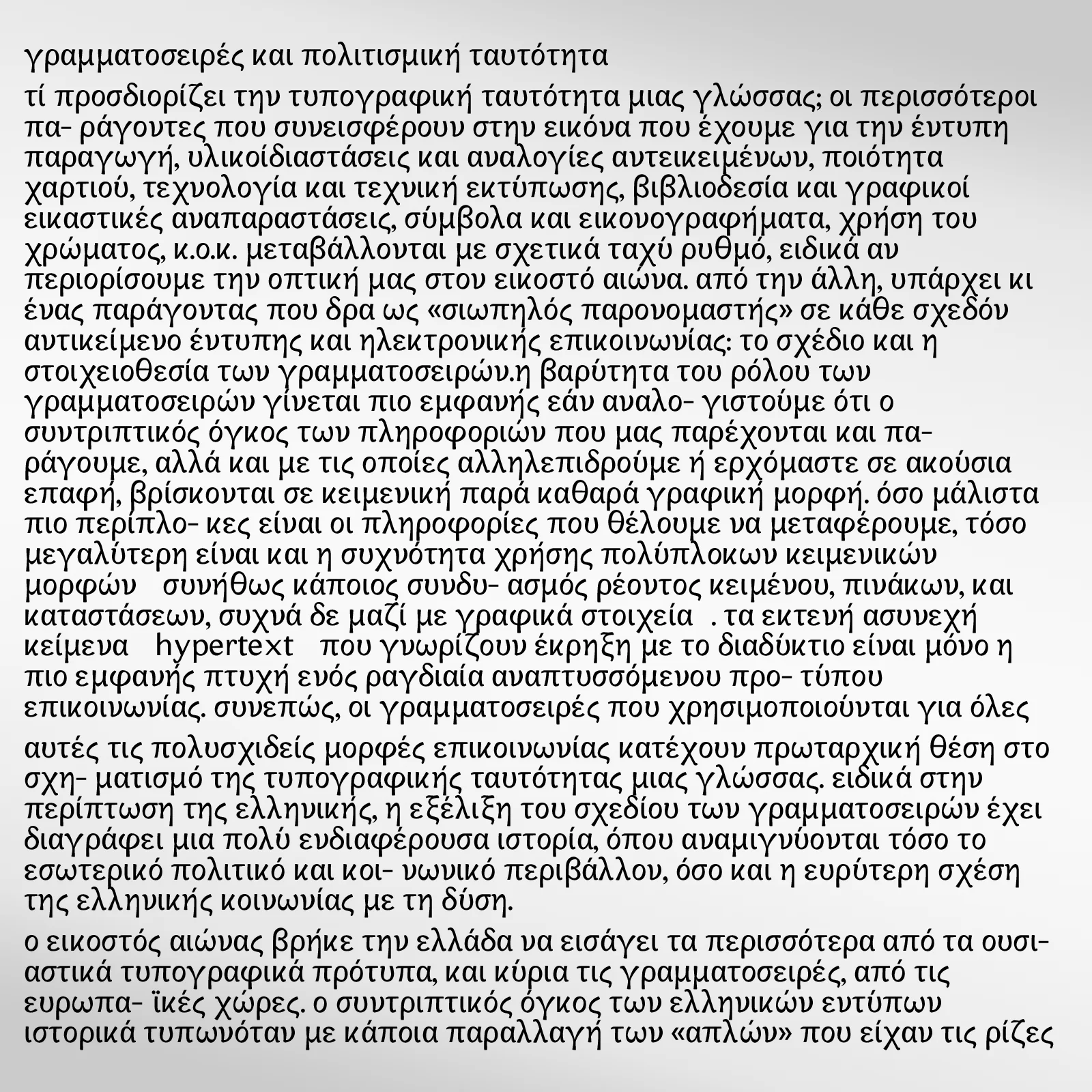
Sample greek text. Getting the right spacing was difficult.
In conjunction with analyzing how the scripts were written, we look at the historical development of each script. The history of each script can greatly affect the overall design. It is also important to understand the history because within typography non-latin scripts were often manipulated and changed in order to fit technologies, particularly hot metal. Hot metal printing presses could only hold a 225 character (later changed to 272) number of characters, therefore any writing system that had more than 225 characters had to be manipulated and changed so it works on a hot metal press. Now that we have modern digital type we don’t have the same constraints, therefore, it is important to understand what changes were made for what reasons so they have be fixed.
I began by designing Greek. When I first started sketching and digitizing letters I was worried I was doing it wrong. The more I worked on my Greek the more I liked it. I learned that because I don’t have preconceived notions about what the letters should look like, I felt freer to explore what the shapes could look like. Greek also taught me how to be better with bezier curves, because the language has more rounded shapes than the Latin I was forced to draw more curves improving my skills.
The large number of rounded shapes in Greek as well as the lack of a strong vertical rhythm making spacing greek more difficult than Latin. The spacing in Greek is more dependent on the counters as well as establishing good spacing between the rounded characters. This has taught me to look more at the counters in my latin typeface designs. I have often been told by various people to design the counters, but I don’t think I truly understood what that meant until I was designing Greek. My letter spacing has also improved because of my work on the greek.
I am starting a Hebrew typeface and I am approaching it with a lot less fear then when I was designing Greek. Now that I know I have already designed a script that I can’t read I know that I am able to do it so there is a lot less fear. Hebrew will be a completely different challenge because it has a lot of similar repeating shapes and has a strong vertical shape to it. It also has a completely different history to Latin and Greek which affect the way that it is designed and viewed. I know this will provide a unique challenge and I will learn things I never thought I would. I am excited to see where this new challenge takes me.
More About Typography
In a previous article, I highlight great free fonts available for download. Unfortunately, not all of the fonts can be used for commercial projects. So here is a list of the best free fonts you can download that are free for all use case scenarios (print, digital, commercial, etc.)