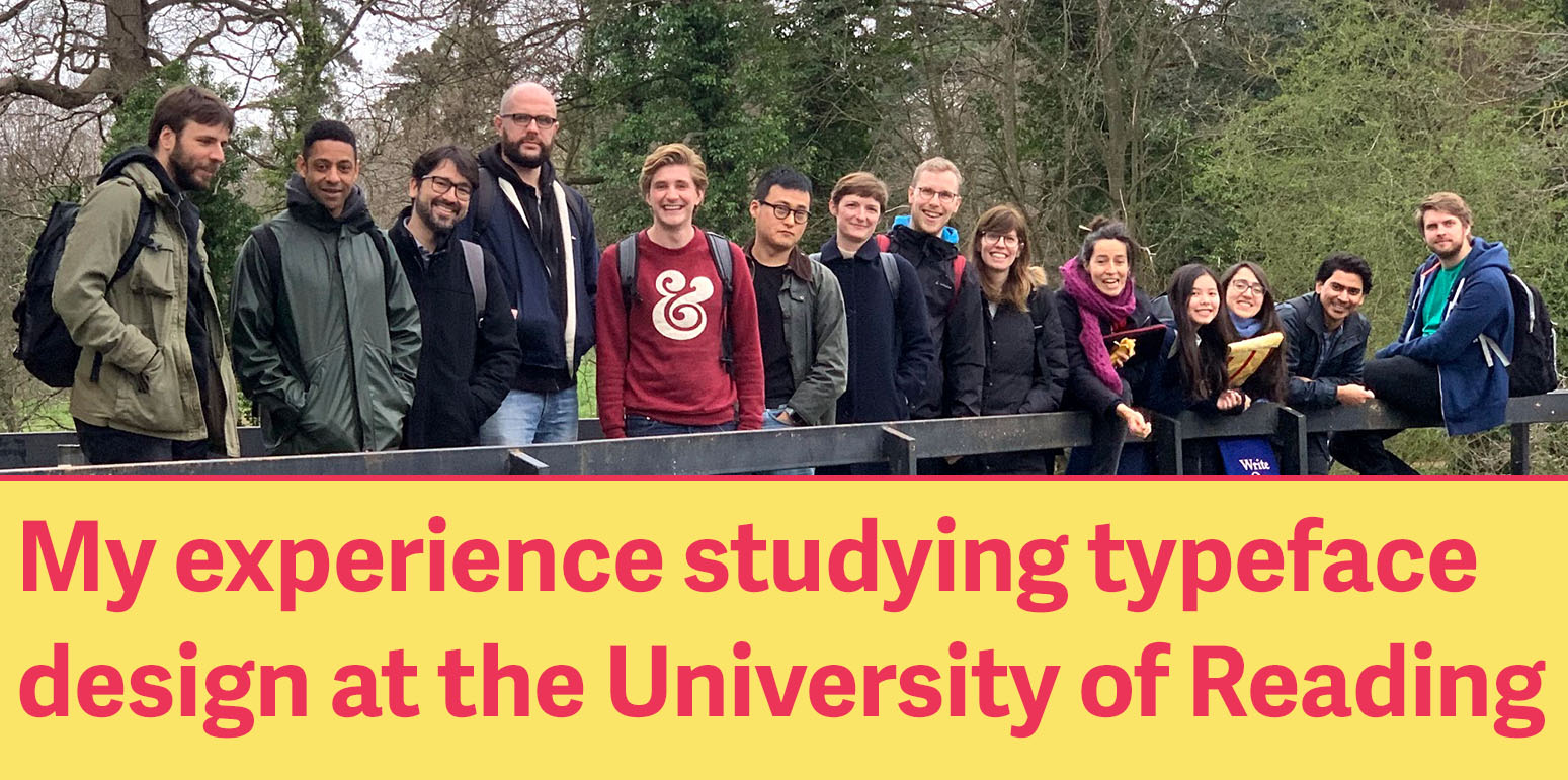
My experience studying typeface design at the University of Reading
By: Alex John Lucas
Edited by: Paige Lytle
When I was applying for master’s programs in typeface design, there weren’t a lot of online resources talking about the student experience at any of the universities I was looking at (the University of Reading, the KABK (Koninklijke Academie van Beeldende Kunsten), and École supérieure d'art et de design [ESAD]). After completing my masters in September of 2019, I wanted to write about my experiences at the University of Reading to hopefully shed some more light on the student experience, as well as some things I learned along the way.
About me

I studied Visual Communication at the University of Kansas and graduated in 2011. During my undergraduate studies, I took general knowledge typography classes, as well as a typeface design class—I wasn’t very good.
After graduating from undergrad in 2015 I moved to NYC and worked in graphic design internships and freelance design. After a year I began working full-time in advertising. At my job, I was fortunate enough to take a six-week typeface design class at the Cooper Union. It was at this program that I decided I wanted to pursue a degree in typeface design.
Why I choose Reading
When researching master’s degree programs in Typeface Design, the best resource I found was Wikipedia, which had a list of all the schools globally with typography programs. Through this list I was able to narrow down my search to three schools: the University of Reading, the KABK (Koninklijke Academie van Beeldende Kunsten), and ESAD (École supérieure d’art et de design d’Amiens). Each program was uniquely different.
Reading attracted me through its design school’s website, typefacedesign.net, where I was able to find dissertations from former students. The university’s strong academics are what drew me to Reading. I also liked that I would not only be learning how to design a typeface, but I would also be writing a dissertation and completing research. Reading also appealed to me because the program didn’t just focus on the Latin script, Instead, it requires students to design in scripts they aren’t familiar with.
KABK appealed to me because the portfolios that its graduates create is strong. The work that comes out of the KABK is beautiful. I also knew about it because Troy Leinster, who taught my course at the Cooper Union, went to the KABK and spoke highly of the program.
ESAD appealed to me because the program was small—only five students—and was in France. I had previously lived in Paris and was itching to go back to France and practice my French language skills.
After applying to all three schools, I was accepted to Reading.
My experiences at Reading
Moving there
Since I wasn’t able to visit any of the schools before applying to grad school, I moved to Reading without ever having visited it or having talked to anyone at the university. I didn’t know what to expect. After completing the program, I would recommend reaching out to Gerry Leonidas, the head of the MATD program before applying and while you’re in the process of moving. He is a great resource and will be very helpful in your transition.
Before moving there, I had quickly ruled out trying to find an apartment, as it would have been difficult to navigate while living in New York City. I decided to sign up for student housing. I ended up living in Bridges Hall, which is reserved for graduate students. There were a few advantages to living in Bridges: most of the students were older and therefore it was quieter than the undergrad halls, and it is next door to the Design building, so I didn’t have to walk far to get to class. While my experience in the halls was mostly good, there were a few downsides. Since there was an undergraduate hall—with a bar—next door to Bridges, there were nights when I was woken up by loud undergraduates. While my flatmates and I sought help from the university, they didn’t address the problem.
If you don’t want to live in student halls and are looking for places to live in Reading, reach out to Gerry. There is a house next to campus where typography students usually live, and Gerry can help put you in contact with them.
Enrollment
The enrollment processes at Reading is rather opaque and difficult to navigate. When I arrived on campus I had to go and get my visa at the Carrington building, one of the central buildings on campus. You will need your visa for enrollment, which happens next door at the Palmer Building. All of the resources you need are located here which is convenient.
One big concern I had was registering for classes, as I assumed this was something I had to complete. I later learned that as a Masters of Arts in Typeface Design (MATD) student, Gerry sends out a Google calendar with the class schedule, and there is no class registration required. The classes change week to week depending on workshops and speakers.
Along with the class schedule, he shares a Slack channel with the whole class. Through this group, we were able to organize a dinner with the people already in town the first night at the Queen’s Head, a pub near campus with a great garden during the summer.
A day in the life
While the schedule changes if there are workshops and speakers, there is a basic schedule the program follows.
Monday: Collections sessions at the Museum of English Rural Life (MERL)
The collections sessions were some of my favorite classes. In them, we were able to look first-hand at a broad range of books or magazines. Each class had a topic that ranged from Emigre Magazine, to Italian Futurism publications to the history of dictionaries.
Tuesday morning: Seminars
Seminars are presentations by fellow students on an assigned topic in typography. These topics range from the more practical aspects of typeface design, like punchcutting, hot-metal type, phototypesetting, etc., to more abstract ideas in typeface design, like what constitutes a typeface family.
For the seminar presentation, you are required to write a paper about the topic and send it to your classmates, so they can read it before your presentation.
Tuesday midday: History of Type with James Mosley
The history of typography class begins with drawings in cave paintings and extends to modern times. James Mosley is one of the foremost historians on typography. This history class is great overview of typography and provides a context for the rest of the work we do in the program.
Wednesday–Friday
These days would usually range from presentations from speakers, workshops, or critiques and reviews of the typefaces we were designing.
During the first part of the year, there are a wide variety of workshops. Many of them aim to build a foundation of knowledge and design skills that can be used for the design of a typeface as well as when writing the dissertation. A few of my favorite workshops were letter cutting, calligraphy, and the GlyphsApp tutorial.
Workshops
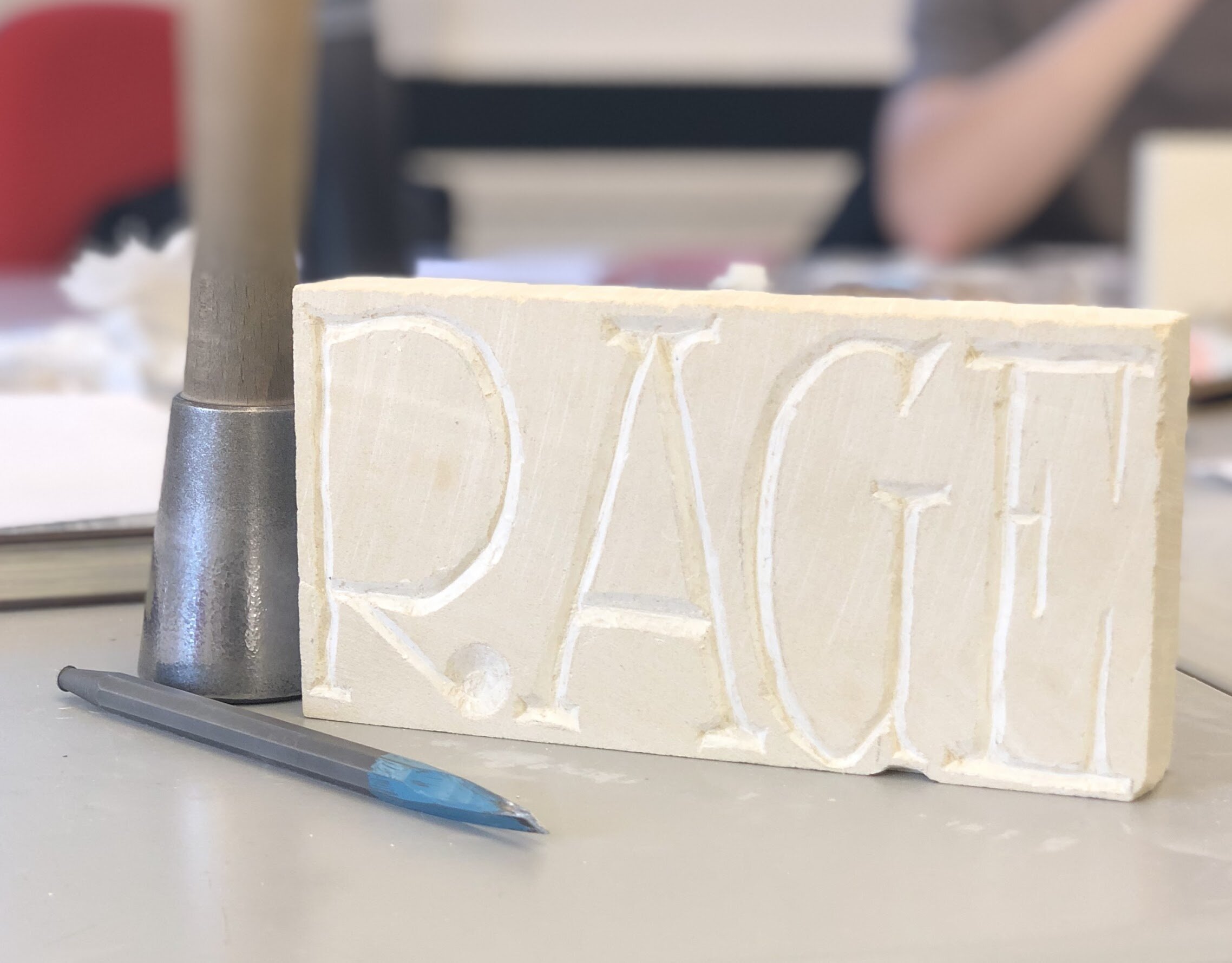
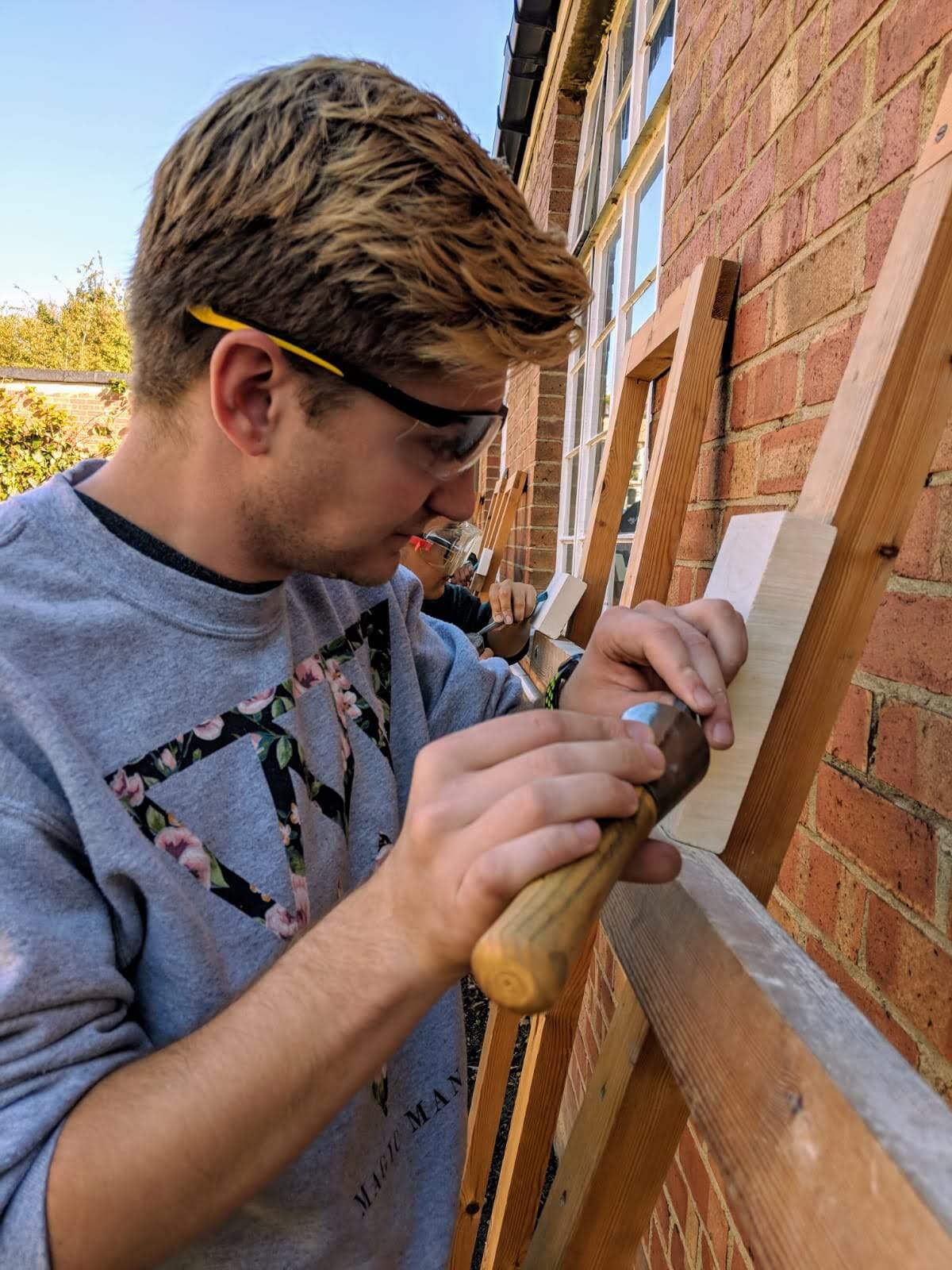
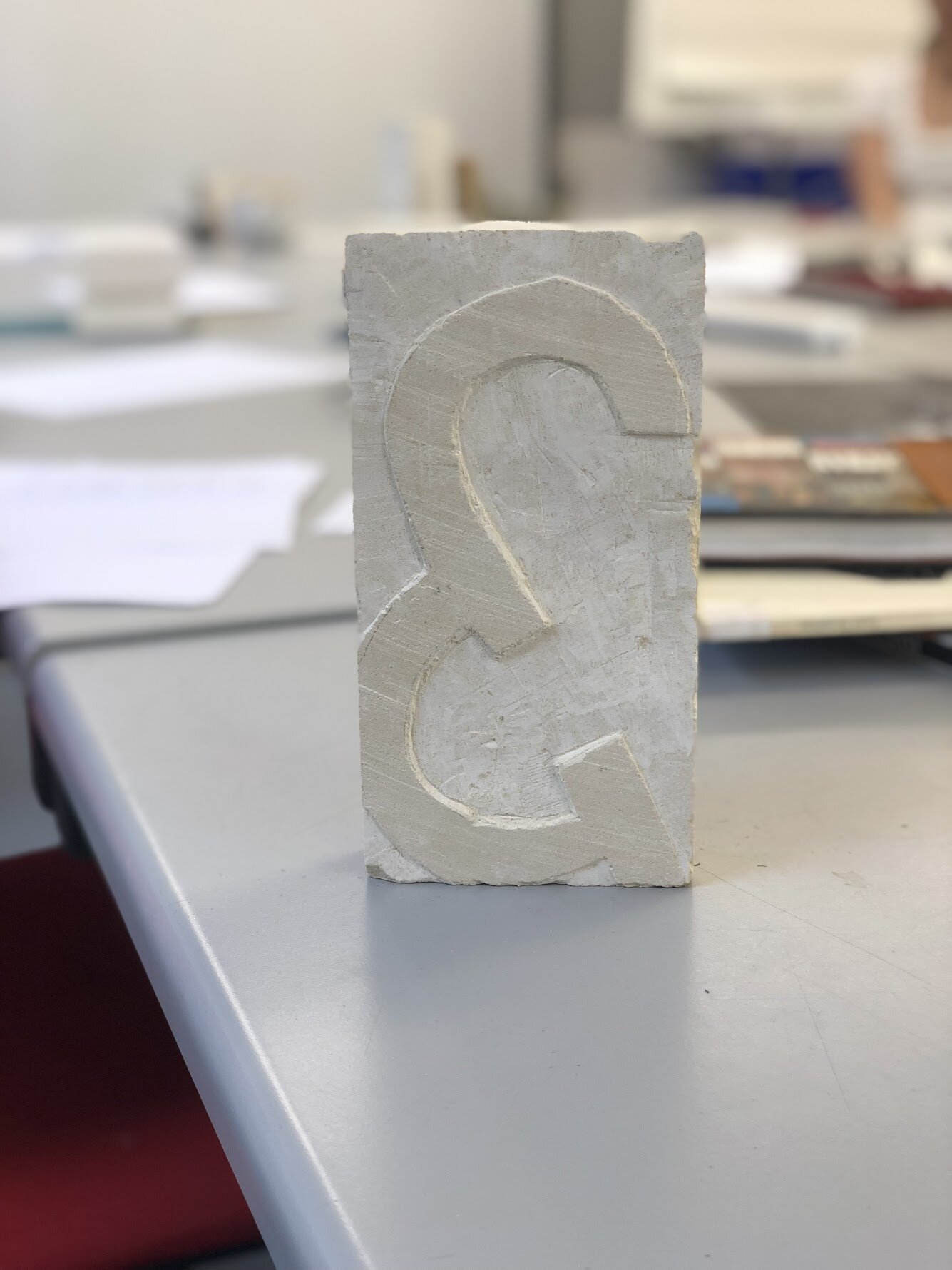
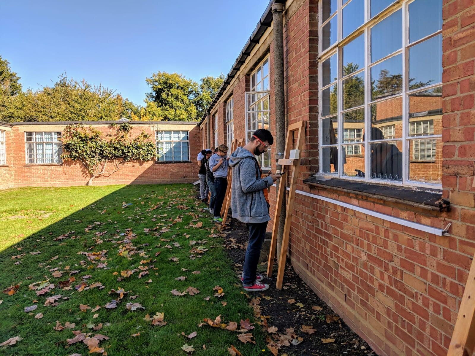
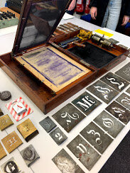
Letter cutting with Wayne Hart
During this workshop, we learn how to carve letters in stone. It’s a fun few days where you learn how to do something that no one gets to do. The class taught me to look at letters in a different way and understand how they are constructed. Wayne Hart is a graduate of Reading and now works as a stone carver. I recommend checking out his work.
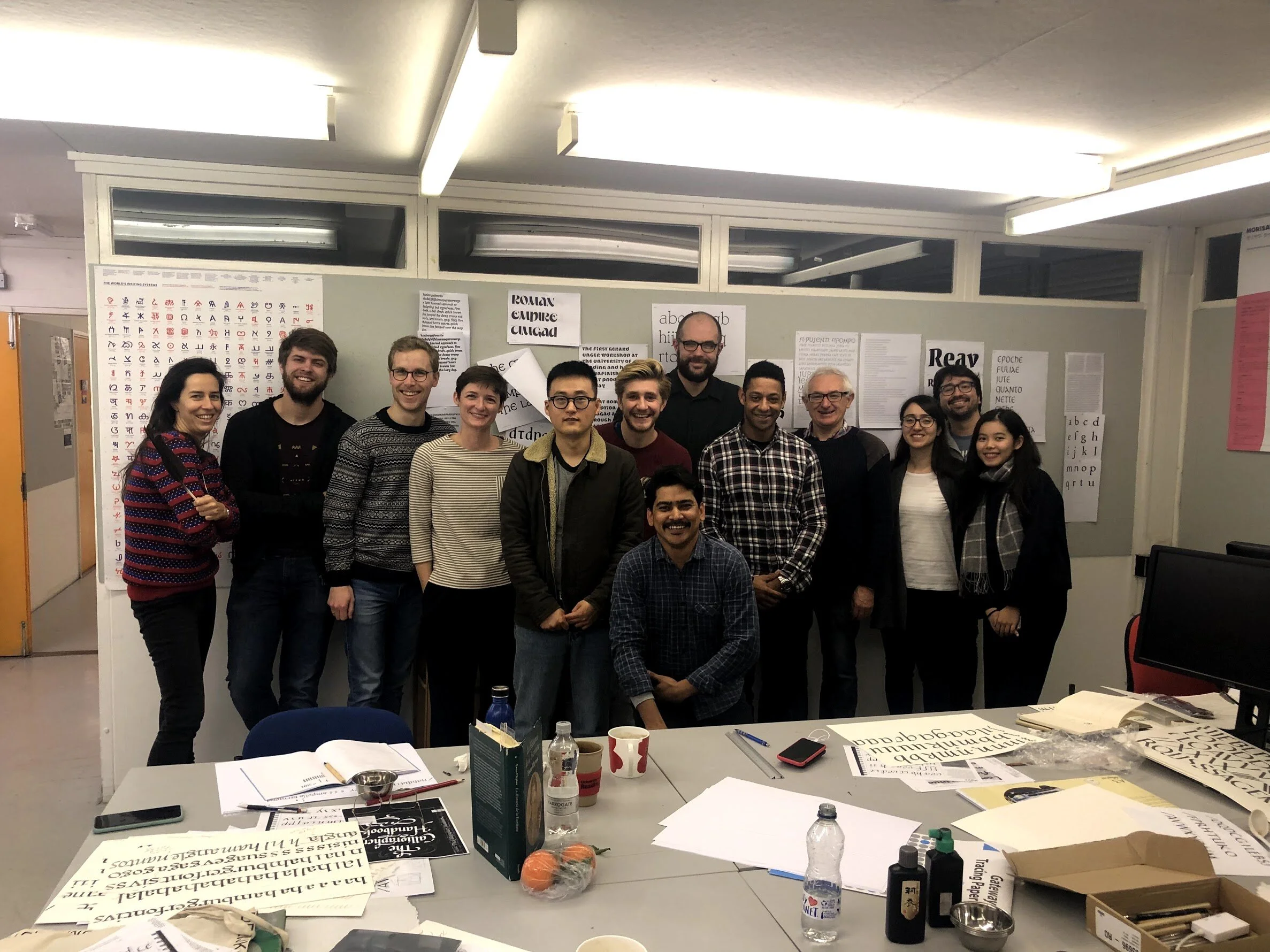
Calligraphy with Ewan Clayton
I have never enjoyed calligraphy. I find the repetitive nature of drawing the same letter over and over boring and aggravating because I am not good at it. I can never get my hand to do what my mind wants. Ewan Clayton made me enjoy calligraphy. This multi-day workshop was informative, practical, and I learned about the structure of letters and how the alphabet we have today evolved because of handwriting.
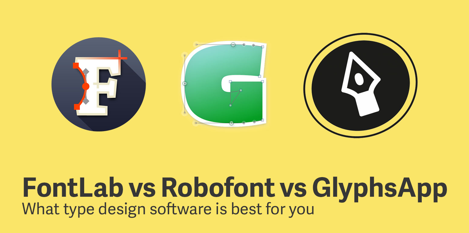
GlyphsApp with Rainer Erich Scheichelbauer
Rainer Erich is one of the developers and creators of GlyphsApp (the typeface design application used by most people at Reading). This workshop was one of the most practical workshops because it was an in-depth instruction on how to use the software, and it was given by the creator. I learned how to set up a typeface project, best practices, and little tips and tricks. If you ever have any questions or problems with GlyphsApp, Rainer Erich is a great resource to reach out to. He is very responsive and helpful (either through the GlyphsApp website or his personal twitter).
Typeface Revival
One of my favorite workshops was to revive a 16th century Vennician typeface from printed books. My group was assigned a typeface name Dominici. Over the course of 4 days we designed a full set of upper and lowercase letters. This workshop was great because it taught me that I can work quickly, as well as how to make dozens of small decisions about the overall design of the typeface. If you want to read more about this process check out my article here.
Trip
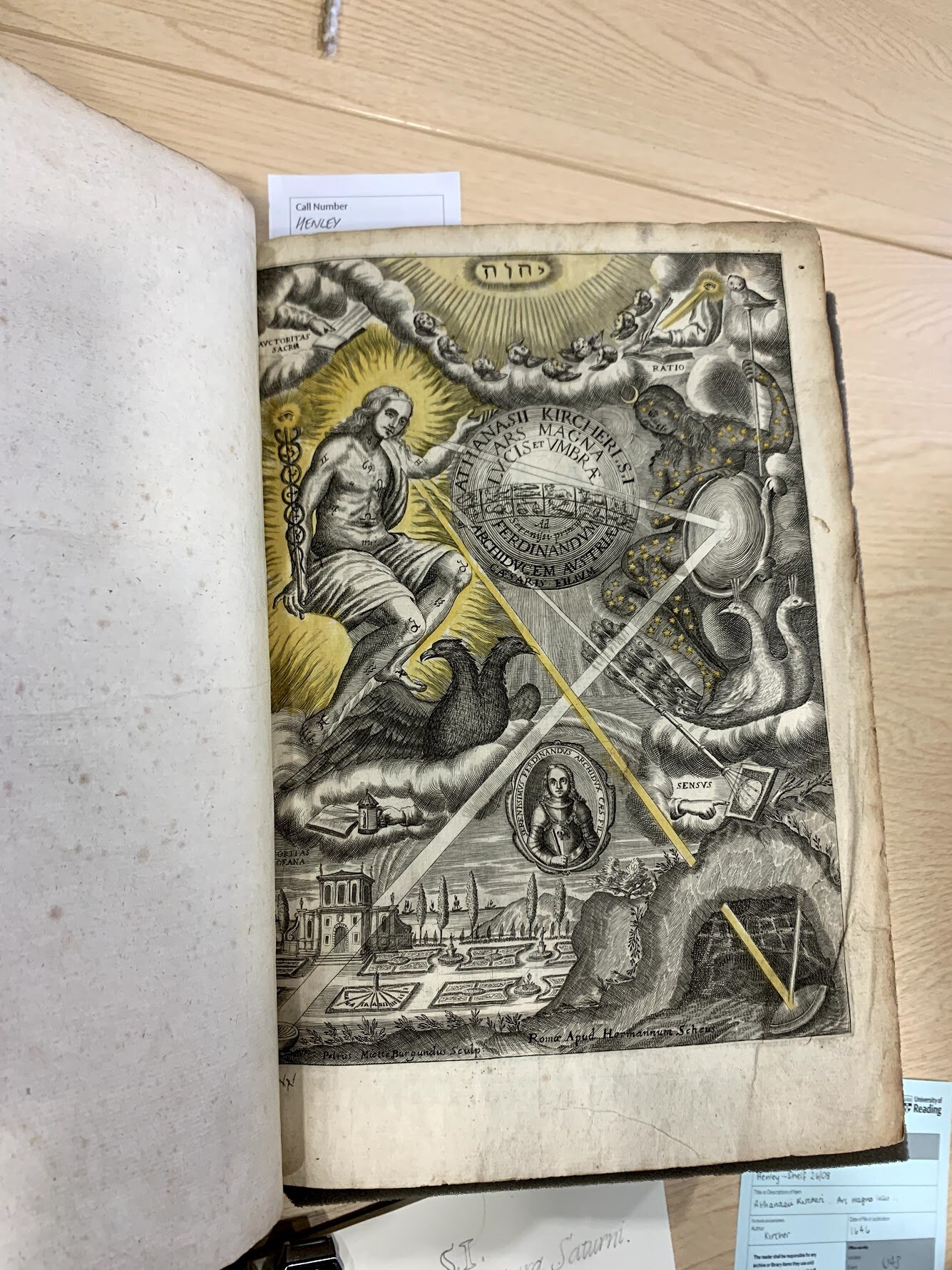
In November we took a trip to Antwerp, Amsterdam, and the Hague to look at typography archives and visit the Plantin-Moretus Museum, a printing working from the 16th century. This trip is one of the highlights of the year.
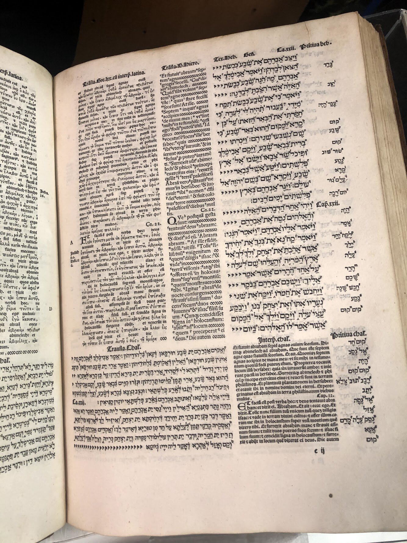
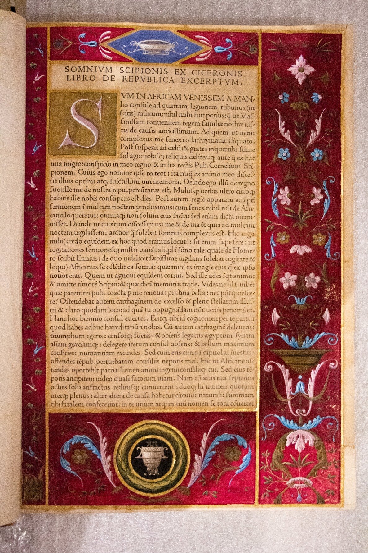
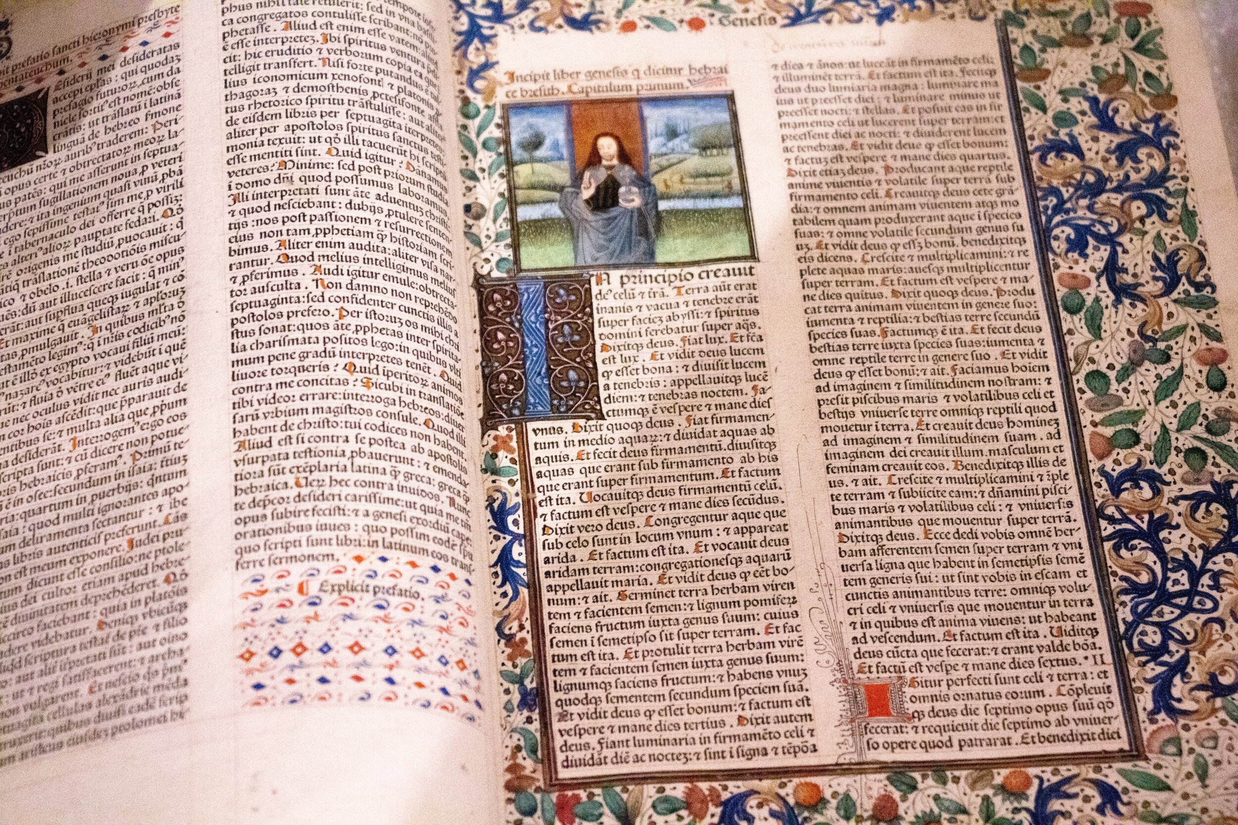
We began the trip in Antwerp at the Plantin-Moretus Museum. The old printing factory has been turned into a museum with many of the original tools and presses preserved. Here we saw the museum put into context many of the topics that we had been studying throughout the year, like punchcutting. In the afternoon after touring the museum, we were able to go and see the museum’s archives. All of the manuscripts that we saw were printed at the Plantin-Moretus. The pièce de résistance was the Polyglot Bible, which is a translation of the Bible in four different languages. We were able to see the proofing version, which had annotations, corrections, and changes marked up throughout.
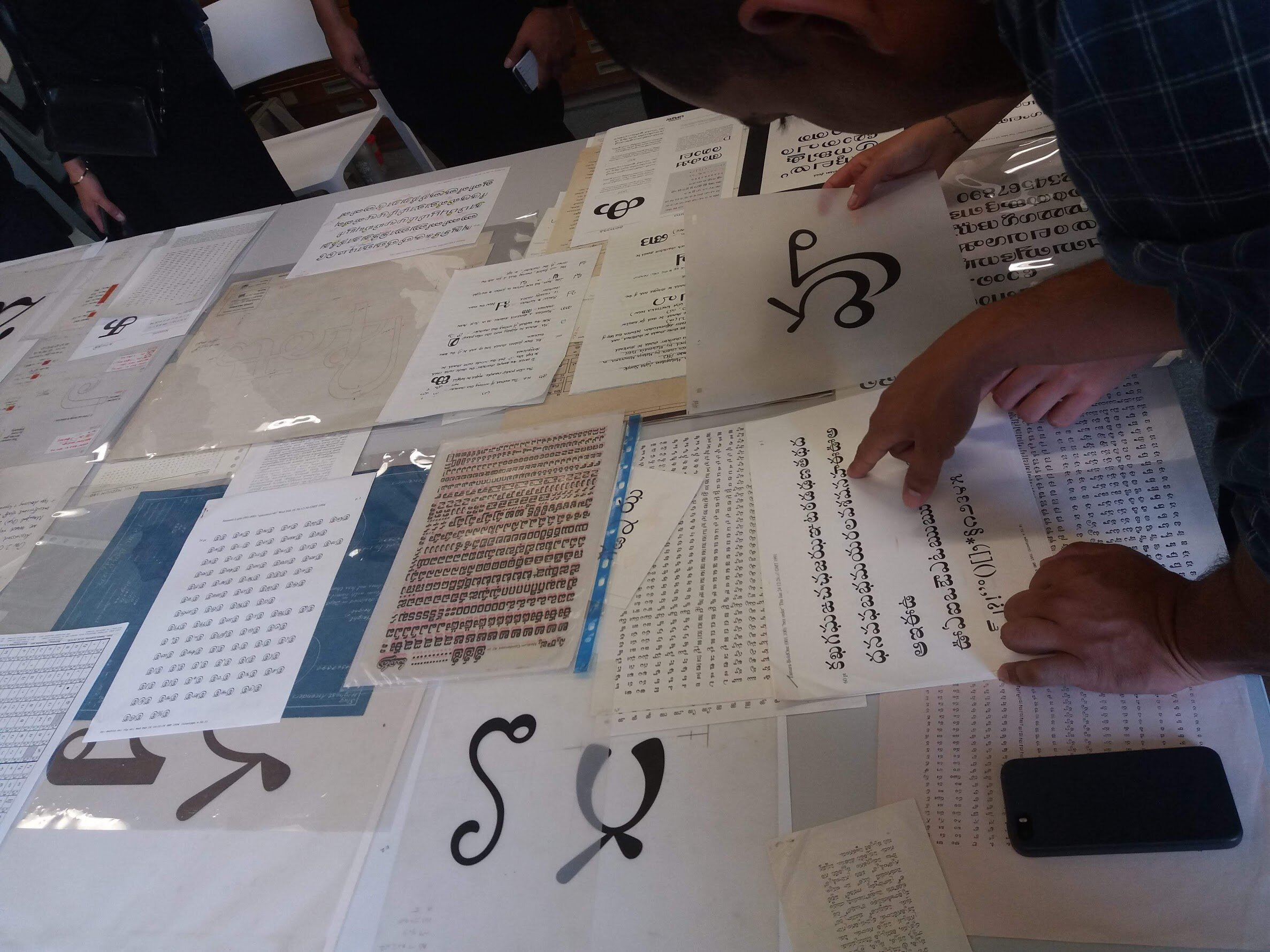
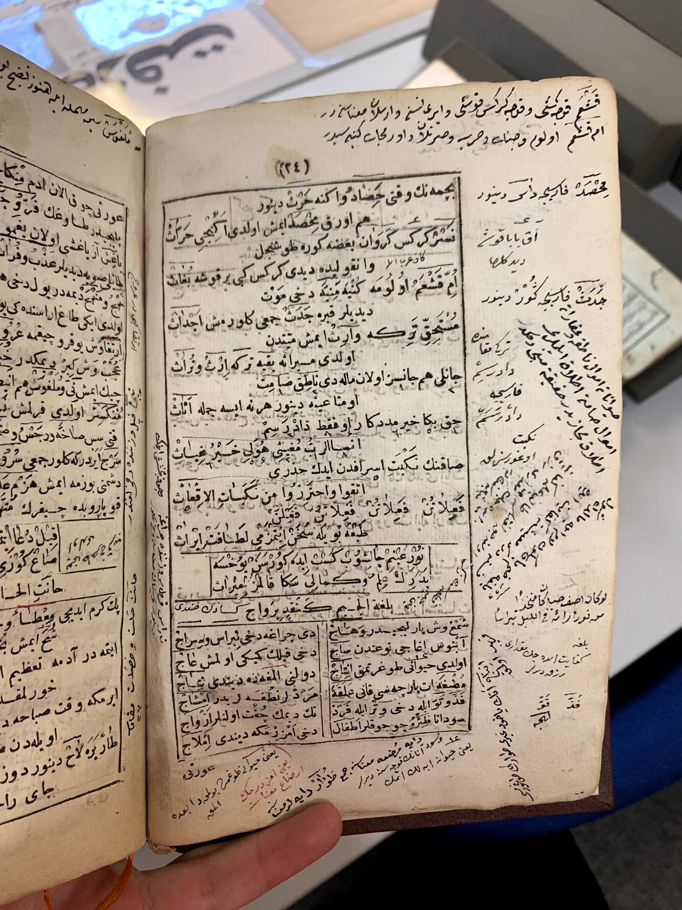
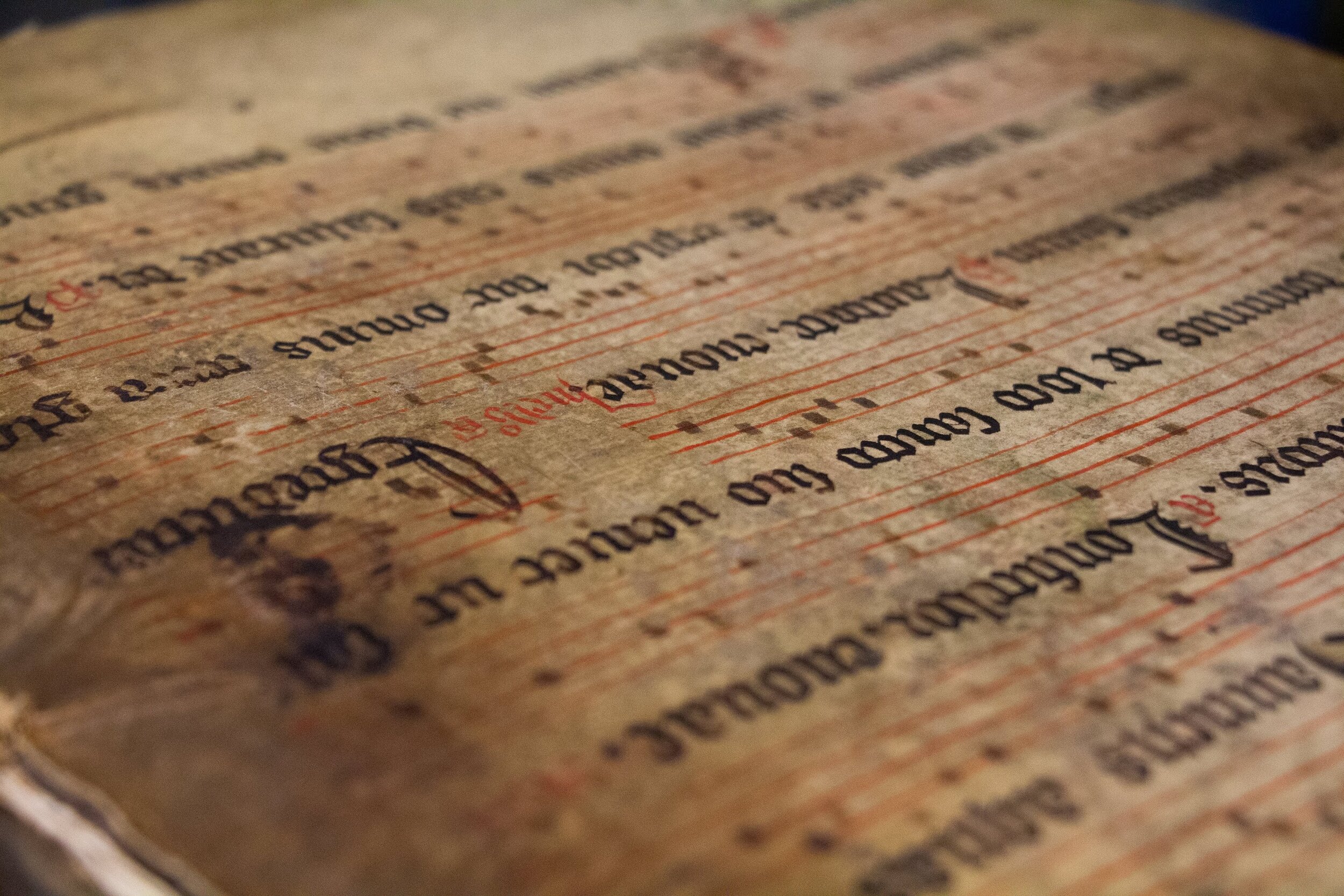
After Antwerp, we went to Amsterdam where we spent time looking at the University of Amsterdam’s collections. These were some of the most beautiful typography specimens that I have seen. Most of the specimens were of display faces, as well as some of the working designs for typefaces.
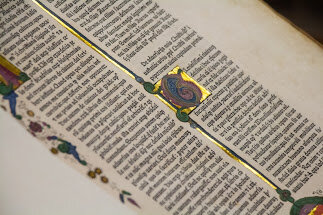
The final stop on the trip was the Hague where we went to Museum Meermanno, which has the best collection of books I have ever seen. All of the books were from the private collection of Willem Hendrik Jacob. Since Willem was a book collector all of the books are in mint condition. There are no notes in the margins or any damage to any of the books. Each book looks as if it was just printed.
The trip to the Netherlands is one of my favorite parts of the course. While some of these places you would be able to visit alone, the access and knowledge of Gerry, who leads the trip, is what makes the trip unique.
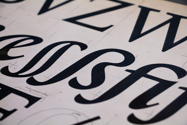
Practical Project
The two grades in the program are the practical project, a typeface you design, and the dissertation. The practical project runs from November until June. When starting the practical project we were required to write a brief detailing an issue or problem that our typeface aims to solve, as well as the usages, design style, character set, and any special features of the typeface. Reading requires that for the practical project you design a non-latin script that you aren’t familiar with. This presents its own unique challenge.
When I was first designing my typeface I was daunted about where to start. There were so many things to do, lots of which I had never done before. My biggest recommendation is to jump right in. In the beginning it is more important to start designing so you can make mistakes and learn from them. I can confidently say no one in my class regretted starting their typeface earlier, especially because everyone is rushing to finish at the end. I started designing some of my typeface over Christmas break. This gave me something to talk about and critique when I got back.
I quickly learned the most important part of critique is creating a good useable proof sheet. In order to correctly evaluate your typeface, it is important to create proof sheets that test the specific variables you are working on. For example, if you are testing your spacing you need to compare your spacing to another version of your typeface, or a typeface with high-quality spacing in order to objectively evaluate how even your spacing is. It can be difficult to structure your proofing sheets but they are of the utmost importance.
When it came to designing my non-latin typeface (I chose Greek), I was intimidated and didn’t know where to start. Reading does a great job of offering introductions to different scripts, so I learned how to research, evaluate, and break down other scripts to understand important parts of the typeface.
Once I began drawing the glyphs I quickly learned that another script isn’t as intimidating as it seems. It also taught me how to be more expressive in my latin typeface. This started the vicious cycle of continuously reviewing my different characters trying to get them in the right place.
The expectation is not that at the end of the year you have a typeface that is ready to be sold and go to market. Instead, the goal is to give you the tools needed to do so in the future. My typeface is far from being complete. It needs lots of work, but I am confident that I can finish the typeface because I have the foundation to know how to do so.
At the end of the project we turn in specimens of our designs which are supposed to show off the unique features of the typeface. Along with this we submit a Reflection on Practice, which is a review of what we learned, our challenges, and our successes when designing this typeface. I enjoyed being able to step back and critically think about what I had spent months doing.
Dissertation
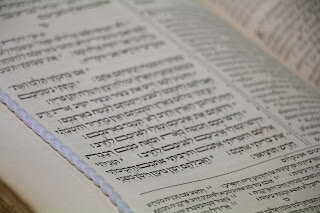
After the practical project I turned my attention to the dissertation. While we had to submit a potential dissertation topic in February, we weren’t locked into the topic and were able to change it if we wanted to. I stuck with the topic I chose, which was Analyzing Secondary Styles Across Non-Latin Scripts. While I didn’t change my topic, I was able to narrow it down to focus on four scripts—Hebrew, Cherokee, Lushootseed, and Bengali— with the help of my advisor Eric Kindel, the department chair.
I treated writing my dissertation like my 9–5 job, which made writing my dissertation less stressful, especially when it came time to turn it in. I typically would go research at the library or in the typography department (there is a great library and archive there). I was lucky enough that most of my resources were at Reading so I didn’t have to travel to do research, like some of my classmates.
There were times it was difficult to do research. The University closed the library on the weekends and limited the hours during the week (it closed at 5). Overall I enjoyed writing my dissertation. My advisor pushed me to dig deeper and keep researching, which led to better writing than I would have achieved otherwise.
Conclusion
Gerry Leonidas, the program director, does a great job of preparing you for job prospects and life after the program. He explains what it means to get a job designing typefaces full-time, as well as what other jobs lie out there for typeface designers.
Overall my time at the University of Reading was great. The best decision I could have made was to take time off and get a master’s degree in typeface design. I highly recommend the program if you are thinking about studying typeface design.
This was a brief overview of my experiences getting my Masters degree. If you have any questions feel free to reach out to me. Gerry is also a great contact at the University.
Read more about Type

The typographer John Hudson puts it best variable fonts are “a single font file that behaves like multiple fonts”