How to Make an Italic
Thanks to Microsoft Word regular, Bold, and Italics are assumed to be standard for every typeface. Users assume that when they hit the I at the top of the page a slanted version of their text will appear. As long as some slanted text appears the majority of people don’t care what the typeface looks like. It is up to the typeface designer to decide what slanted text they will see.
Developing an italic for your typeface is as important as designing a bold (these are the two most commonly used features). Creating italics can be intimidating because you are creating a new typeface that is supposed to go along with your roman. Italics don’t need to be intimidating, instead, they can be fun and offer more freedom than the roman characters.
History
The designs and evolution of italics are deeply rooted in history, therefore it is important to understand the history of italics before designing them. Italics connection to the written hand affects the design of the characters much more than their Roman counterparts, which have a greater detachment from the written hand.
Italics are based on cursive handwriting of Italian scribes during the 16th century. Lowercase italics come directly from the cursive written hand, leading to in and out strokes on letters, even though they aren’t connected. Meanwhile, the uppercase italics have traditionally just been an oblique (slanted) version of the Roman Capitals.

Aldus Manutius
The first italics were developed by Aldus Manutius. Manutius would set his whole book using italics in order to save space, as paper and other resources were expensive. Italics were also used because they gave the book the look that they were handwritten instead of printed. Over time the use of italics has changed, now italics are typically used to denote something or for emphasis. Italics quickly gained popularity, and many printers began to copy Manutius and print with italics.
In 1690 The Roman du Roi radically affected italics in two ways: first, it was the first typeface where the italics were designed specifically to be used with the Roman. Until this point printers would use whatever roman and italic were available. The idea of a font family didn’t exist, instead, printers would use whatever was on hand. The second development, the Romain du Roi italics were not a true italic instead they were an oblique version of their Roman counterparts. This was a break from the tradition of using italics referencing the written hand.

Romain du Roi Italics. University of Reading Archives.
Even though the Romain du Roi used obliques they were not common in typefaces until the 19th century when sans serif fonts became popular. Obliques have traditionally been seen as the italic counterpart for sans serif fonts, while the entrance and exit strokes are seen as the italic corresponding to serifs. These correlations are not set in stone and there is still lots of debate amongst typeface designer about the correct italics to use with each typeface.
Real Italics
Creating real Italics is more complicated than creating obliques because italics are a completely different text face which will require redrawing or adjusting each character more than is needed for obliques. Typically I will use my roman letters as a base which I will adjust but this will still require some characters (g, a) to be designed from scratch. This is also depended on your design and how much the italics deviate from the roman.
One of the first choices is how close the italics should match the roman. Some typefaces look almost the same with just a few tweaks. Whereas other faces have italics that are a completely different design, with similar proportions to the roman. The amount of contrast between the italic and roman is important to consider because the italic will typically appear with the roman. The point of italic is to differentiate the text so it is important to decide how distinct that text should look.

The contrast between italics and roman are important. The goal of italics is to emphasize or draw attention to specific copy.
One large factor in how separate italics look compared to the roman is how slanted the italics are. Italics that are more slanted are naturally going to stand out more than the roman, whereas a more upright italic is going to need other defining features to distinguish it from the roman.
When designing real italics I typically like to begin by duplicating my roman. This gives me a good starting place: there are predefined proportions, and design elements that I can use to start my italic design. It is important that the roman and italic have similar proportions to ensure that when they are used together the heights, weights, and proportions are consistent.
To start I take my duplicated roman and slant the characters using the angle tool in my font editor. I will typically play around a bit with what angle I want my design to be at. When deciding on the angle start with the letter n because it shows the angle better than other characters. Round shapes and slanted shapes don’t show the angle as easily as more square shapes. I also shy away from starting with letters that have ascenders and descenders because the height makes the angle seem more dramatic.
Once I have decided on an angle I will change the entire font to that angle so when working on each glyph each character has the same starting point. This is the point where I will begin to add features that make it specifically italic. The features you add are dependent on what kind of design you are going after. One of the most common features that differentiate italics is instrokes and outstrokes. A great way to get ideas for unique features is to reference other typefaces.
The two characters that change the most drastically are the lowercase a and lowercase g. Both of these will typically change from two-story shapes to one-story letters. There are typefaces that keep the a and g two story letters, none of the features of italic typefaces are set in stone. Other features that may change: the f will typically get a descender, the lowercase k might have a loop, the v and w might become more rounded. The beauty of italics is that there is lots of freedom in the design, and can be design driven. So feel free to be creative with italics incorporating design elements that you enjoy.
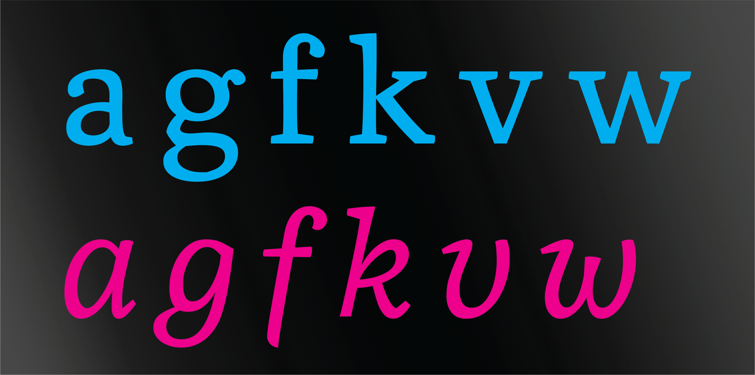
Characters that are traditionally drastically from their roman counterparts. Typeface: Robert III by Alex John Lucas
In order to make italic capitals see the next section on make oblique italics. Italic capitals are easy because they are traditionally just obliques.
Obliques
Obliques are the more modern form of italics. They are typically just a slanted version of the Roman letter form. Slanting an existing roman typeface is much easier and faster than creating a real italic because characters don’t typically have to be redrawn. Obliques typically require a bit of tweaking and adjustment.
Starting obliques is similar to the initial processes of making real italics. The first step is deciding how slanted to make the oblique. Letters that have a greater slant will stand out more than letters that are more upright, this is not an exact science and something that requires playing around. Since there aren’t a lot of defining characteristics in obliques it is often better to add more of an angle so the obliques will stand out from the roman.
Once again I will start with the characters that don’t have ascenders and descenders, as they affect the optical angle of the letter. After deciding on an angle and adjusting the angle of each letter I will make adjustments to the point placement on my letters, also known as “curve compensation” which you can read more about here.

The slant on individual characters is different for each character even though the characters all visually seem to have the same angle. Typeface: Gotham Regular by Hoefler and Co.
For your ascenders and descenders and capital letters, the decrease of slant needs to be decreased. The extra height descenders make the shapes appear to be leaning more than they are. A great way to see this is to print sample texts of italics and draw a line through what appears to be the optical center. They should have the same optical center even if that means that the angles are different.