
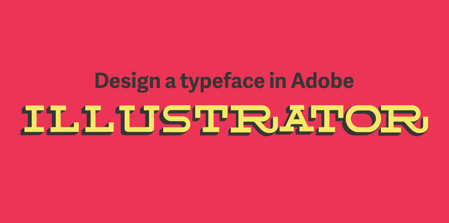
Design a typeface in Adobe Illustrator
Lots of people ask how they can design a typeface without having to purchase typeface design software. Being able to play around and design a typeface without the risk of purchasing a new software product can be a great way to see if typeface design is something you want to pursue. Or maybe you want to create a brand new typeface that you can use for a branding project, or just for a one-off design. Thankfully most designers have Adobe Illustrator, which is a perfect tool for exploring and playing around with designing a typeface. Now with Creative Cloud (CC), it is easier than ever to use an Illustrator typeface across all adobe produces through your library.
1. Sketch a design and get it into the computer
The first part of creating any typeface is choosing a design. If you need help getting started sketching out your ideas for a typeface check out this previous post.
When I am digitizing my sketches in Illustrator I like to import a picture, usually taken on my phone, and place it on a locked bottom layer. Another way that you can import your drawings is to use the Adobe Capture App. This phone app will scan your drawings and turn them directly into vectors that are accessible in your CC Library. The reason that I don’t use this app is that my drawings typically aren't refined, there are lots of stray pencil and pen marks. This app is great for people who have really clean drawings.
I also prefer to have more control over the point placement of my bezier curves (learn more about using the pen tool and bezier curves), so by tracing my sketches in Illustrator, I am able to retain more control over the design of my letters. When digitizing your letters there are considerations and tricks that are important to consider—like optical adjustments— you can read more about that here.
2. Digitizing your design
When you are digitizing your designs in Illustrator it is important to keep a few things in mind that are different from designing in a type design software.
2.1 Define your type dimensions
You need to make sure you are defining the dimensions of your baseline, x-heigh, ascender, descender, and cap-height. Don’t forget to include overshoot for all of the round characters. This will ensure that when all the letters are used together they will appear the same height.
2.2 Don’t have the fill on when drawing
When you are drawing your letters with the pen tool make sure that there is no fill, and a stroke color that is visible (I use cyan or magenta). If you have a fill color the fill will block what you are drawing, making it hard for you to see the drawing underneath. The opposite is true with the stroke if the color of the stroke doesn’t stand out you won't know what you are drawing.
2.3 Utilize the Pathfinder tool
The Pathfinder tool in Illustrator is one of the most powerful tools in Illustrator. Make sure you are taking advantage of it, particularly when making counters. But also use the pathfinder to combine different shapes together, most letters can be made with your basic square and circle shapes (if you prefer that to the pen tool).

Refining the characters that I have created in Illustrator.
3. Refine your drawing
Once you have created your drawings it is important to refine the drawings. Refining your drawing will ensure that your typeface looks good in every situation. The first refinement I like to do is remove excess pen points on my shapes. When I use the pathfinder tool stray points begin to crop up. Removing these extra points will smooth out the shape ensuring the highest quality design.
Another refinement is ensuring consistency across all your characters. This doesn’t mean that all of your shapes need to be exactly the same. Instead, it means that all of your shapes should look the same, or that they are part of the same family. This consistency will look different for rounded shapes and square shape. Rounded shapes naturally appear thinner than square ones, so the strokes need to have a little more thickness to them.
4. Use your new typeface
Once you are happy with the design of your typeface you are ready to begin using it. Thanks to CC Libraries this is really easy no matter what program you are using. To use my new design I will create a new folder in my CC library with the name of the typeface. Then drag and drop each of the letters you created into the new fold you created one at a time. It is important that each letter is separate because when you use it in programs like Photoshop you can drag and drop each of the characters individually and use them.

Using Adobe CC Libraries to upload each letter so they can be used in any Adobe Product.
Creating a typeface in Illustrator is super easy particularly for someone who is starting out, and wants to explore typeface design. Adobe makes it easy to use your typeface across all of their products so you don’t have to waste time trying to get your new typeface to work in other programs. If in the future you decide to take the plunge on a typeface design software you can import your illustrator vectors directly into the software and turn it into a real design.
More About Typography


In a previous article, I highlight great free fonts available for download. Unfortunately, not all of the fonts can be used for commercial projects. So here is a list of the best free fonts you can download that are free for all use case scenarios (print, digital, commercial, etc.)